art of Robert Liu-Trujillo Tag

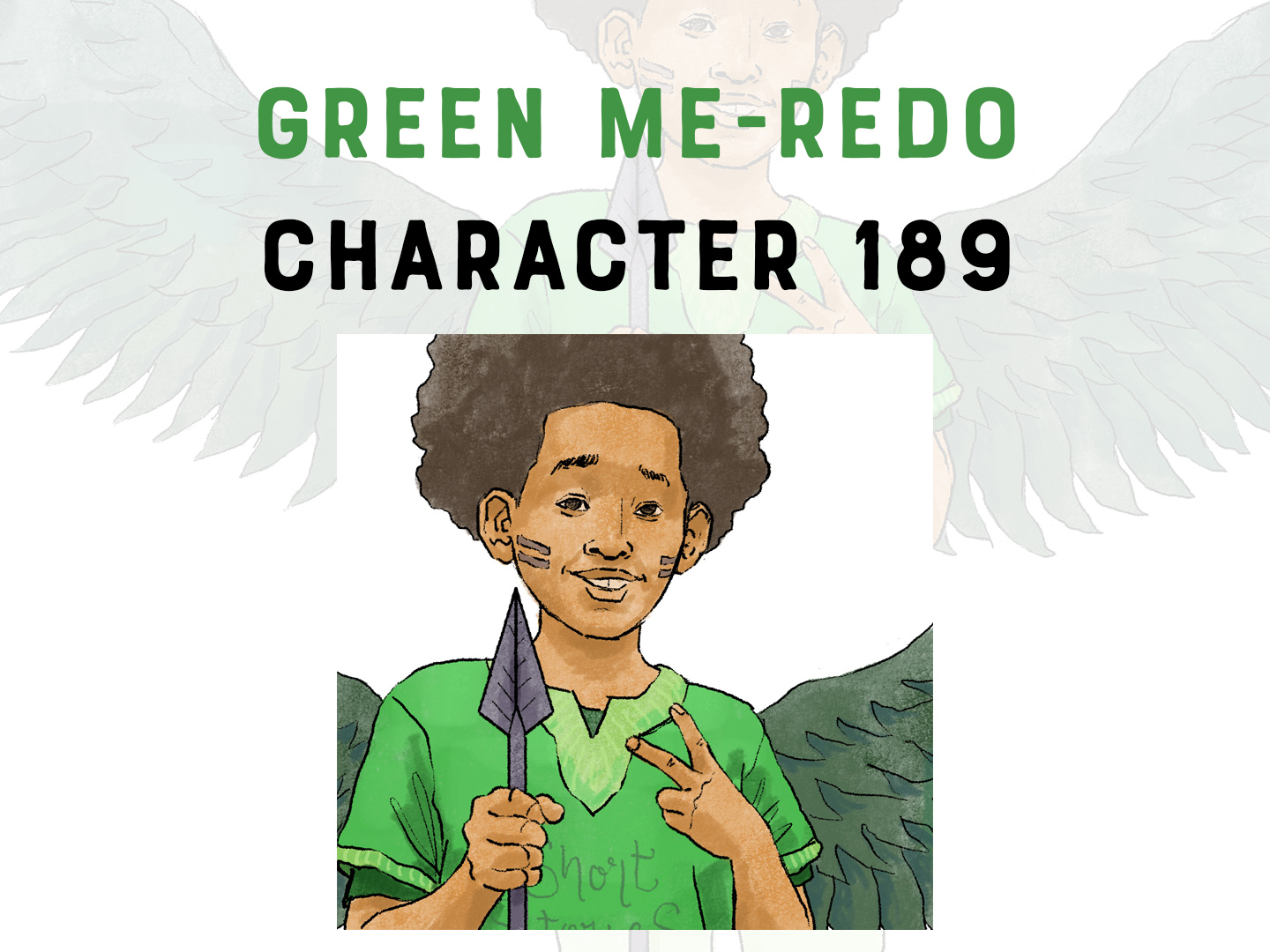
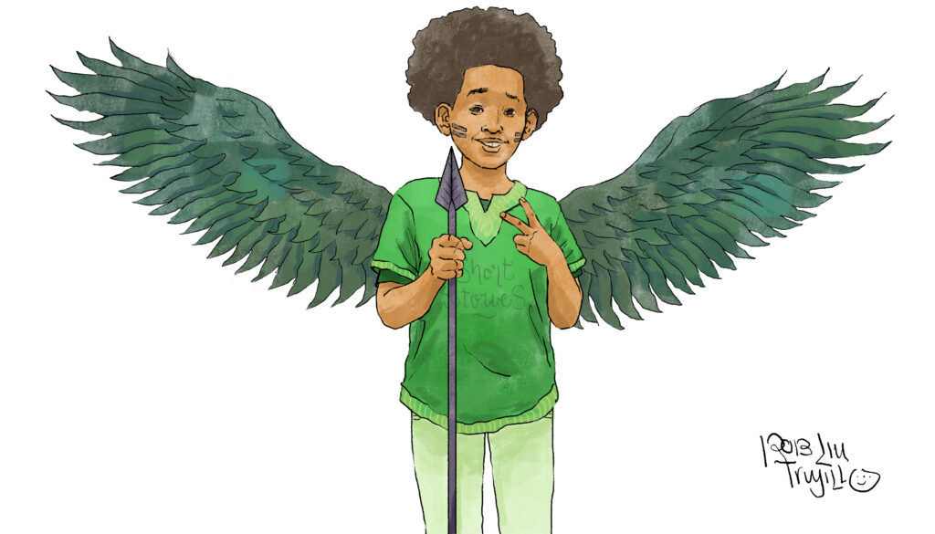
Character 189 – Green Me REDO

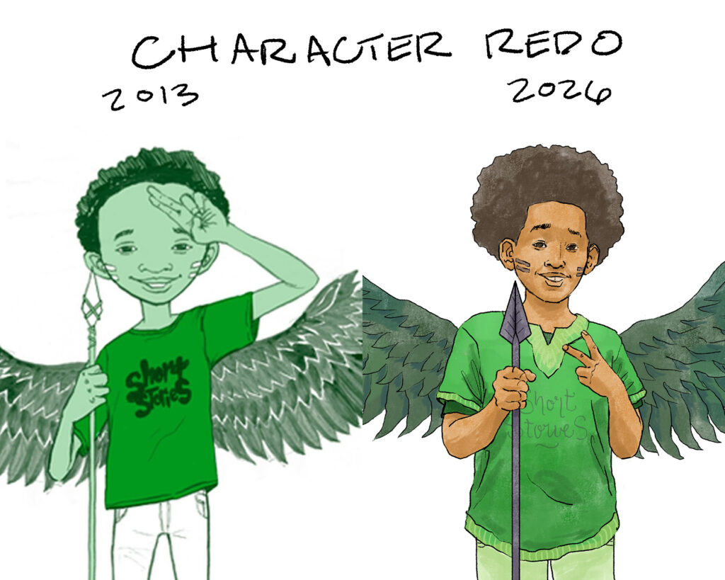
I’m on stuck a little bit so redoing old work helps me to get unstick and to stay in the process of making, trying, playing, testing. Here’s a redraw of an old character I made for my website, branding, all the things back in 2013. The original was based on a childhood photo and this was fun to redo.

The hand signal says I come in peace, but the spear says “dont start no shit”.

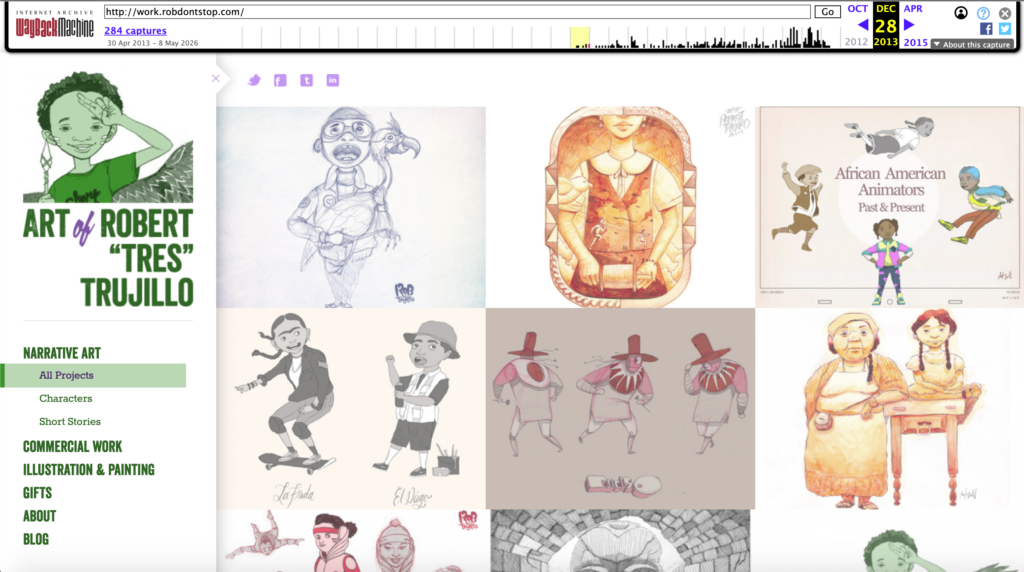
Here’s an old image of what my website used to look like (designed by my wife) w/ this same image.

Dig this? Check out this Collage of Characters from 2022-2024

Art for Rethinking Schools Magazine

Ok, Its been over a decade since I worked for Rethinking Schools but I’m so happy to be back in the mix. In a day and age where books can be too long, and tik tok clips too short, and the internet filled with AI slop its nice to have a form of physical media that informs. About what you say? Read on….

Rethinking Schools MISSION and VISION:

Rethinking Schools is a nonprofit publisher and advocacy organization dedicated to sustaining and strengthening public education through social justice teaching and education activism. Our magazinebooks, and other resources promote equity and racial justice in the classroom. We encourage grassroots efforts in our schools and communities to enhance the learning and well-being of our children and to build a broad democratic movement for social and environmental justice. 

Our Zinn Education Project — coordinated with Teaching for Change — has more than 100,000 educators who have registered to access our “people’s history” materials.

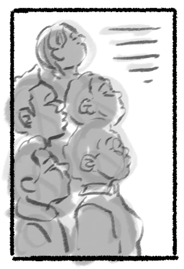
Here’s a bit of process art to show my thinking when ingesting, sitting with, dissecting, and analyzing former principal Gilbert Juan Armenta’s piece about how school systems continuously target Black children by overly discipling them, singling them out, punishing them, and trying to track them into special education. I know this experience intimately after being suspended from my school for “talking” as a 3rd grader!!!!

The cool thing about this article and the magazine is that it talks about real issues that teachers, educators, and others are experiencing in the classroom. They talk about race, gender, identity, politics, class, racism, and how to address these issues in a way that is radical, sensitive to the age group, and respectful. This is what drew me to the magazine years ago. See my old piece here.

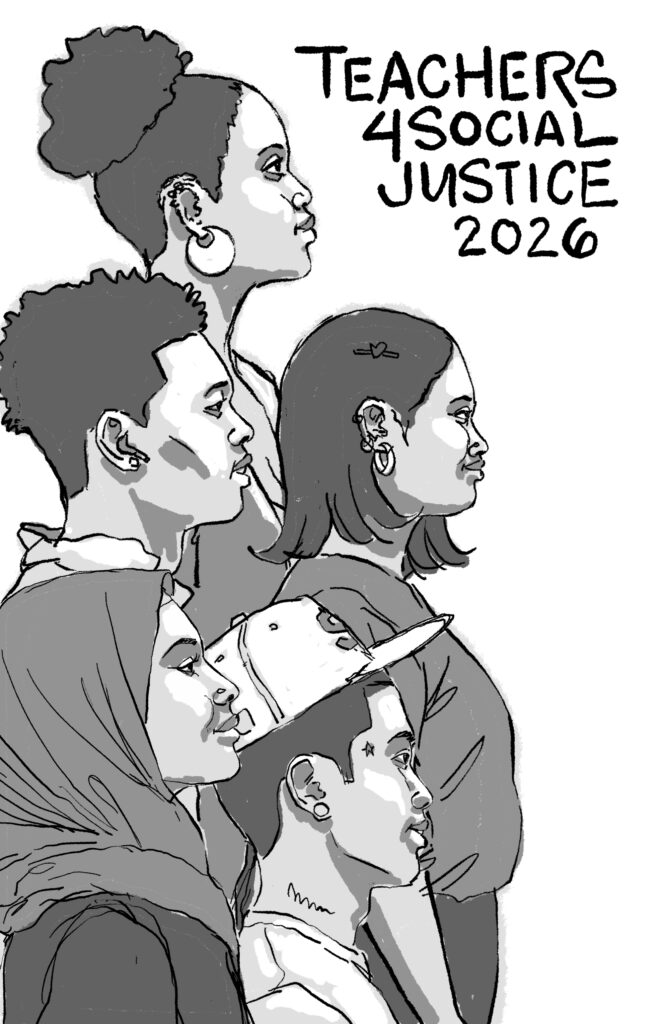
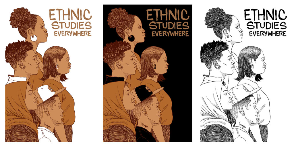
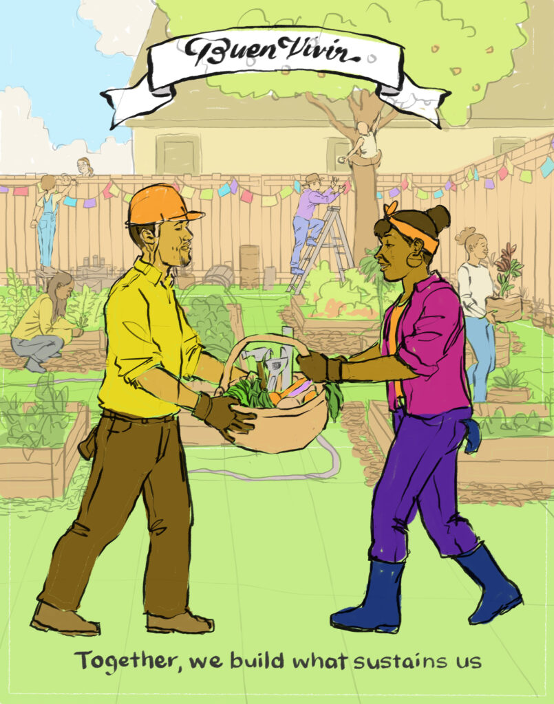
Here are some color directions for this piece.

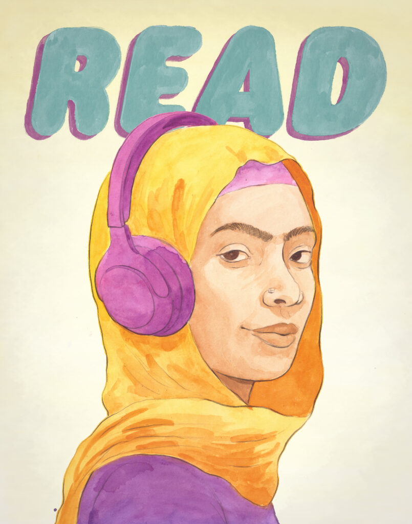
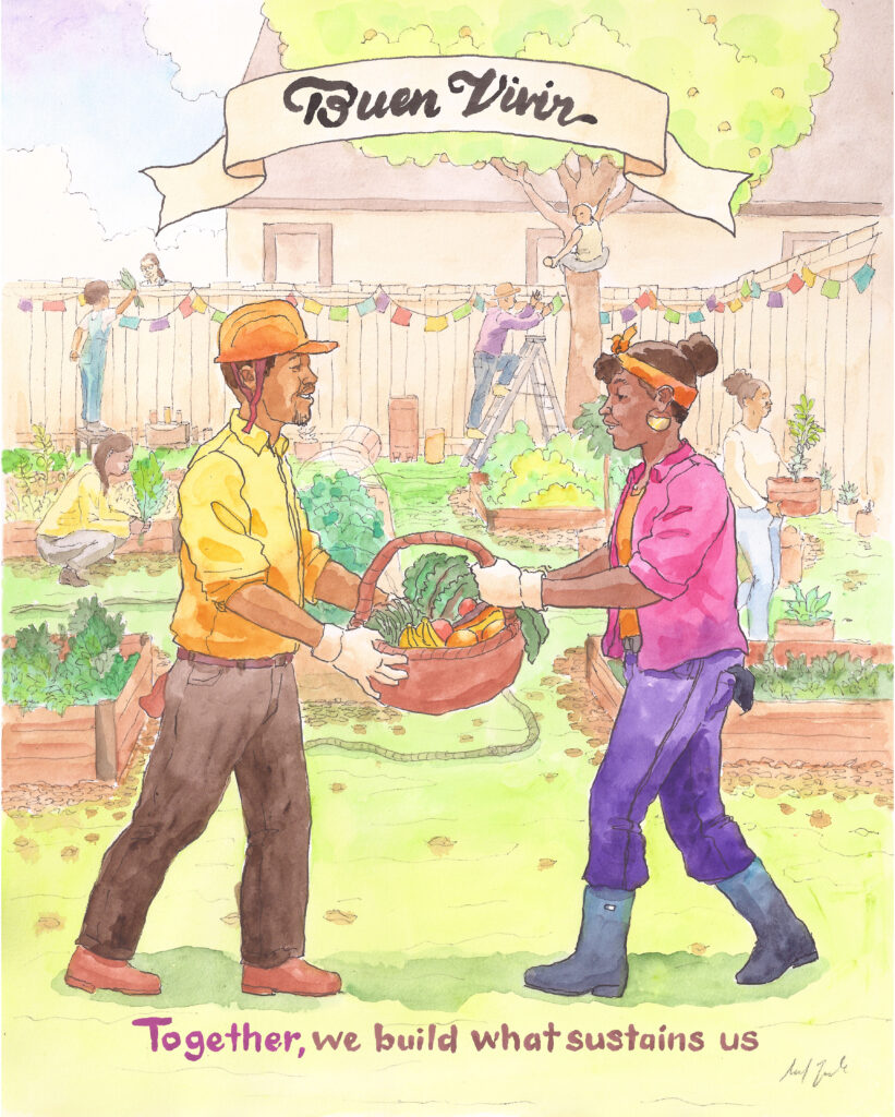
Heres the final painting, done in ink and watercolor. Shout out to AD Nancy Zucker for the call!

Wanna get this magazine issue? COP Volume 40, Number 4 HERE.

Dig this? Check out

Wanna peak inside the magazine? See it a little bit here.

Book Cover – 826 Valencia + De Marillac Academy

Last Spring I began working with 826 Valencia to illustrate a book cover for the De Marillac Academy, a middle school in the Tenderloin neighborhood of San Francisco. And I have a history with this organization as I read there when I was just beginning to work in kid lit and I took my son and his class on a field trip there over 12 years ago.

The thing I remember back then was that the folks who started the org had a sense of duty and wonder. Duty in that they were taking it seriously; the charge to encourage literacy and creative writing. And wonder, in that their organization was housed in a pirate ship! Imagine pirate jokes and 4th graders telling you that they are “published”.

And they still have that dedication as this book is one of several published anthologies of creative writing by middle school students. Here’s the synopsis:

“In these vibrant poems, students in grades 6-8th from De Marillac Academy explore their own potential and the comfort of the things they hold dear. They find refuge in the bounces of a basketball and uncover a quiet hero in a cherished eyelash curler. In these pages you’ll find heartfelt declarations of love to their beds and a tenderness towards the quiet world their headphones offer. Students imagine life through the delicate wings of a butterfly, the sharp mind of a beloved teacher, and even providing hope as a lawyer. No matter who holds the narrative today, in the future they are building, these students assert one thing is for sure, they’ll be the ones.

Here’s a bit of process art from the making of the cover.

Shout out to Amanda Boesen and Lucy Goseline-Ratliff who assisted me in narrowing down and refining the sketch until it was right.

You can see the line work here and the color directions. Ultimately it ended up being a combination of colors. The uniforms for the actual students are red and grey though so thats what we ended up using.

And heres the final cover illustration! My fav poem from the book was called “lies” and I loved all the pieces about their video games, favorite foods, etc.

About the organization that does this work and commissioned this art:

826 Valencia equips students with writing skills to create change.

We are a nonprofit organization dedicated to supporting under-resourced students ages six to eighteen with their creative and expository writing skills and to helping teachers inspire their students to write.

Our services are structured around the understanding that great leaps in learning can happen with individualized attention and that strong writing skills are fundamental to future success.

And with chapters in:

  • Boston
  • Chicago
  • Washington DC
  • Los Angeles
  • Michigan
  • Minneapolis
  • New Orleans
  • NYC

and the founding chapter San Francisco (Bay Areaaaaaa) they are taking the task to the next level.

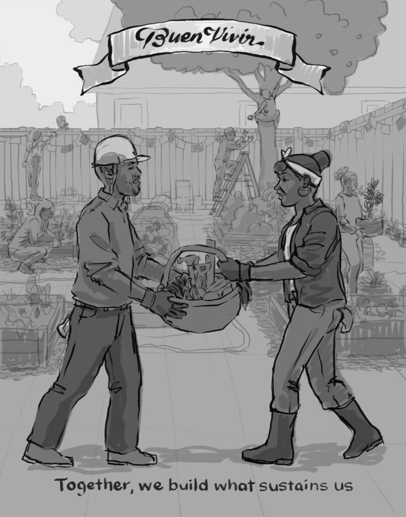
My Art on a Billboard! Somos Santuario!

Originally I created this illustration in collaboration with designer Jules Cowan, illustrator Micah Bizant, and the East Bay Sanctuary Covenant back in 2025. Individually we have each created artwork in service of social justice movements, campaigns, and issues affecting real people. East Bay Sanctuary Covenant has been doing this work since 1982!!!! Read that again.

The attack on immigrant families specifically Latinos has been hard as fuck for decades, but no one was expecting a level quite like that of 2025 and 2026. So it is especially meaningful to have worked with all these folks and now this billboard collaboration is done with the help of another Bay Area organization called the Multicultural Institute. They help support the housing, rights, fair pay, and advocacy of immigrant workers in the Bay.

Here are the original posters by Micah, Jules, and I. See my original post here.

Dig this? Check out this work for the ACLU in a report that studies how central cal sherriffs collaborate w/ ICE.

Sticker art 4 Booker T Washington

Last year I began working with the Booker T Washington Community Service Center in San Francisco California. They are a century old organization offering tons of services and programming for the community in the Western Addition, Fillmore, the Richmond, and beyond. They offer summer camps, afterschool enrichment, free grocery and produce programs, groups for youth and elders, affordable housing, and more.

BTW Mission: Booker T. is a beacon of Black joy and self-determination. We uplift and serve our community, build intergenerational bonds, and work in solidarity with allied communities to reform and reimagine San Francisco.

Vision: All Black people are free to thrive in and shape SF to enable prosperity and belonging for everyone.

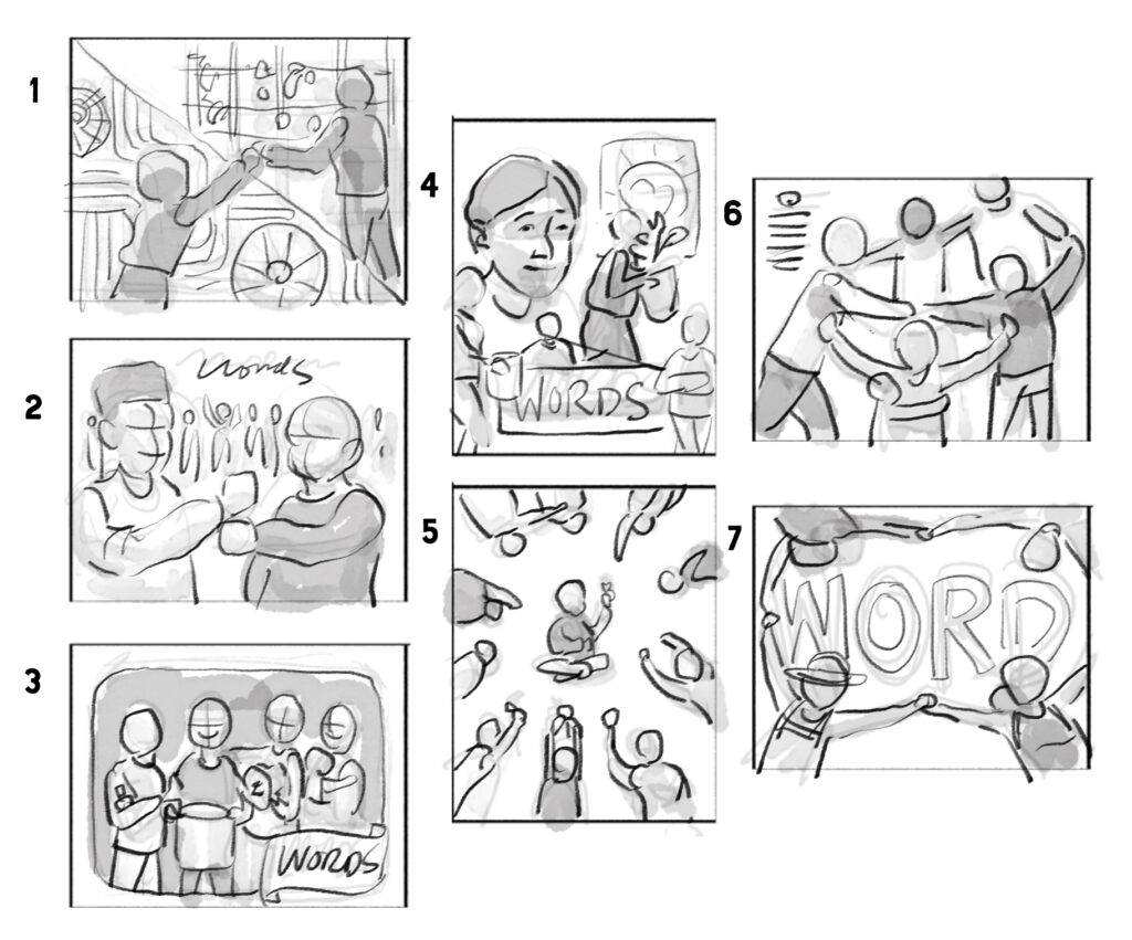
Here is some process art showing the originals thumbnail drawings I made, then redrawing them slightly more refined with grey tones to convey shape, tone, etc.


Here’s some color direction to give an idea of how I take an idea and share several color directions. I ended up using a combination of all of these color directions.

Here are the finals, drawn digitally. I tried to keep them loose and textured using photoshop and Astropad. I think the “lift while climbing” sticker is my favorite. Followed by Honor our Heritage.

Here’s a video of the actual stickers.

Dig this? Check out these stickers I designed for Convergence Magazine or Self Evident Podcast

Character 187 – Paikea revisited again!

I drew Paikea in 2012 and then painted her in 2014. Here’s my most recent version of her. I love love love this film. Whale Rider came out in 2002 and is based on a historic figure in Maori history. It was written and directed by Niki Caro and starred a new comer named Keisha Castle-Hughes. This time I leaned into the emotion more as this scene from the film was VERY emotional. IYKYK.

What other Maori, Polynesian, or Pacifika films have you seen that you enjoyed? One of my other favs is “Merata” about the pioneering director Merata Mita who was the first Maori woman to write and direct a feature film in New Zealand.

I even once did a film study of whale rider which you can check out here.

Dig this? If you like my characters check out my last character collage of figures from 2020-2024

Children’s Portrait 81 – Maceo

Hey, this is my most recent children’s portrait of a young boy named Maceo! I have had the pleasure of painting his oldest sister Niara in 2014 and his middle sibling Aissa in 2020. A whole family of kids and I couldn’t be more grateful and honored to paint children like these. Shout to their momma Emilia for entrusting me with this.
As always, here’s a bit of the painting process which is all done by hand. I take a photo, trace it, then transfer it to a wood panel and paint it step by step. I start with the light colors on the face and gradually build up the darker tones and then the garment the child is wearing or what I imagine them to be wearing.
What is this? This is a series of hand painted, hand crafted wooden panel acrylic portraits of children and or families. I began painting these for local friends in 2012 as a way to announce my new career in kids books. And this has grown to include friends of friends, families, and folks I dont even know. If you’d like me to paint your child please commission me by purchasing a portrait here.

Here are some past children’s portraits: